IMS_Blog
Because I forget stuff. Part of norcimo.com
Note: It appears you must have reached this page by a deep level URL. In general this site is currently down and unmaintained. See here
About This Post
Originally posted May 17 2005 at 23:05 under General. 0 Comments. Trackbacks Disabled.
Stormy Reception
The BBC—that’s the “state” TV (and radio, web, etc) service in the UK—just updated their weather forecasting graphics. It’s caused something of a storm (if you pardon the intentional poor pun) and many comments. I’m not surprised. I don’t like them. Not one bit. Well, OK, I kind of like what they tried, just not how they’ve ended up.
 The BBC probably has a fair argument that the forecasts needed some form of updating. They’ve been around a while and there not as slick as they were when computer graphics for forecasts were a huge innovation (and that was a real change for the better). The problem is that the point is updating, not revamping beyond recognition.
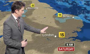
First, there’s the brown. The forecasters have done a sterling job of telling us why the country is now brown until they are as blue in the face as the screens behind them. It’s the best way to show up the cloud shadows (more on that in a moment), the rain. Er, no. Different colours for clouds and ground would have done (apparently this brown looks awful in black and white). And it’s not just about what shows up best. As a viewer experience the country just shouldn’t be brown. That is, of course, assuming you can see your part of the country. Obviously, if you show some weird, pseudo-3D picture then perspective is going to come into it. The parts nearer the “camera” will appear larger. A view from the south is necessary for the country to appear “the right way round”. Not realising that the real affect of this is barely being able to make out the north just shows how badly thought out some of this is (or was it just that it was thought out in the BBC’s and Met Office’s south eastern locations?). Maps are flat for reasons other that technical ability to render 3D. A letter to the Herald, while undoubtedly fighting Scotland’s corner, puts it well.
And those “cloud shadows” they seem so proud of. I’ve tried; I can’t tell whether (ha!) it’s going to be cloudy, sunny, overcast or a sky full of aliens. For a start, unless there is an actual mixture of cloud and sun one is left with a uniform brown field—is it an unclouded sky or is it overcast?? Does an unclouded sky in summer equate to the little happy sun symbol we used to have? And why is nothing staying still? Yes, now we can follow the pattern of the weather as it changes. Unfortunately by the time you’ve found where you are in the country (a few pixels worth if it’s not the south east) and worked out what’s going on with the cloud (muddy brown on dirty brown) and rain (yes, the rain too is represented as a patchiness), the clock has ticked away (in a terrible type face to match the hideous blocky temperatures) and you’ve no idea when that was for. One is simply left wondering what the point was, knowing that the forecast isn’t really accurate enough to justify this finer level of detail.
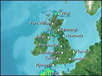
 That rain isn’t too clear either. Almost the same colour as the sea at times if you can work out where it is it does nothing less than make us appear to be an isle of giant lakes. The truly puzzling thing is that the old graphics managed to do this clearly, as the picture shows. Exactly why the BBC couldn’t update this sort of clear picture isn’t, well, clear.
Accepting the muddy country and dodgy (animated, if you please) rain doesn’t get one much further. The zooming about makes it very difficult to get an overall picture of what’s happening across the country. If you miss your part good luck (of course this also means you have to watch the whole thing, rather than just taking a two second glance at a map). The really annoying thing is that the traditional, don’t fix it because it’s not broken, charts are still there, online (though still with blocky, stolen from Sky, graphics). Why can’t they start with one of those and zoom in to do the fancy time progression stuff, to zoom out again to show where we’ve reached. That at least would be cool? Why can’t they overlay our nice traditional symbols on the animated rain and shadowy clouds? Why can’t they give up so that we can actually see bloody Scotland?
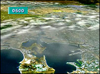
 The BBC have been brave in their attempt. But in the shark world of the media they’ve done nothing but throw away their identity and the sense of superior quality they had to join a glitzy, in your face, dumbed down world, and done it badly at that. Surely they’ll listen and tweak this. Apparently this whole thing is based on a New Zealand system. Notice the white clouds and green country in their version though. Somehow clearer one thinks, though still not as good as simply looking from above.
If any proof were needed that old is clearer than new, just consider the comparison (stolen from the BBC’s own site).

The BBC have moved forward to technology for the twenty-first century. Well done to them. Now, if only they’d realise that doesn’t mean they have to change everything. I’ve seen the idea (somewhere; can’t find where now) of the old graphics likened to releasing an old Nintendo game in today’s Playstation and X-Box world. True enough, but to carry the analogy, the BBC have messed with the game play, never a good idea for a classic. Continuing the software theme, I think Simon Lucy hits it pretty close: Great toy for the forecasters but not for the end users (viewers).
Bring us overviews we understand at a glance. Get rid of silly, slightly different browns and bring in white for clouds, green for land and blue for rain. Never mind trying to make everything go whoosh; this is weather, we just want to know if we should take an umbrella.
Addition: I wrote this up earlier this evening; then I wondered if I was being unfair. I’d only seen a handful of forecasts on the opening day. So I went and watched the weather forecast on BBC Interactive. And News 24. And indeed, the 10 o’Clock news. It isn’t better than I thought. There are some nice touches. The satellite imagery the main forecasts started with was nice. The rest wasn’t. You really could get motion sickness watching all that zoom and panning (I don’t know why that is. Maybe because there’s no reference point?). The dark brown “clouds” look like topography – I kept thinking mountains were moving around. It wasn’t until the forecaster actually mentioned it that I noticed that there was rain somewhere, and even then I couldn’t tell quite where very easily. Even working it out, I realised I’d have to carefully watch the silly timeline animation thing just to know if that rain were showers or persistent, heavy, all day. There aren’t enough place names. For some reason animated wind arrows in 3D world don’t look as good as animated wind arrows in old 2D world (at least we had wind arrows. Next they’ll have isobars! Though I’ll give very good odds they won’t have a scale). Given the outcry I can’t believe this system won’t be seeing some major tweaks pretty quickly. Let’s hope they manage to fix it and not just break it more.
I still don’t know what tomorrows weather will be like (actually I do—I have ForecastFox installed. There’s a symbol in my task bar. There will be showers, and a high of 12°C. Simple, really).
Update: Having just posted this, I’ve only now noticed that even on the example picture of the new graphics Manchester appears to be on the cost and Norwich has flooded, which says it all. Could the BBC simply be over prepared for global warming?
Comments (0):
Post a comment
Name and email address are required. Email address is never shown. If you enter a URL your name will be linked to it (this and other links will have the rel attribute set to contain nofollow). Markup allowed: <a href="" title="" rel=""> <em> <strong> <abbr title=""> <acronym title=""> <p> <br />. Anything else is stripped; please be valid. Single linebreaks automatically convert to <br />, double to <p>'s. Additionally anything that looks like a bare URL should get automagically linked. Many acronyms and abbreviations are also automagically handled.
Please note this blog's comment policy
Trackbacks (0):
Trackback URL: http://www.norcimo.com/MT/mt-tb.cgi/248
© Ian Scott. Powered by Movable Type 3.2. This blog uses valid XHTML 1.0 Strict and valid CSS. All times are local UK time. For further details see the IMS_Blog about page.. All my feeds in one.

